


The best tradie website homepage puts a tappable phone number in the first mobile screen, names your trade and service area in the headline, and backs it with one proof anchor and a short quote form. Nothing else matters until that’s sorted. Most tradie sites fail because the phone number is buried below a hero banner built for desktop, and mobile visitors scroll past it before they ever see a reason to call.
TL;DR:
- The homepage must prominently feature a tappable phone number, trade name, service area, proof anchor, and a brief quote, all above the fold for mobile clarity.
- A fixed click-to-call button and a short quote form with a clear reply-time promise significantly increase lead conversions, especially on mobile devices.
- Load times under three seconds on 4G and a mobile PageSpeed score of at least 70 are essential for retaining visitors and improving search ranking.
- Trust signals like visible license numbers, live reviews, and real project photos build homeowner confidence faster than generic or stock imagery.
- Focus on one high-quality, mobile-optimized homepage pattern suited for your business size, and link to a few top suburb pages to maximize local SEO impact.
Table of Contents
- What is the ideal tradie website homepage layout above the fold?
- How should click-to-call and quote forms work on a tradie homepage?
- What mobile performance specs actually matter for tradie sites?
- Which trust signals actually get tradies more calls?
- How should a tradie homepage link to service and suburb pages?
- Three homepage patterns tradies can copy today
- How Ask Hayley turns homepage enquiries into booked jobs
- What makes a testimonial actually persuasive, beyond a Google star rating?
- What CTAs work besides click-to-call for tradie homepages?
- What layout principles matter most for a tradie’s homepage?
- Should tradies use video on their homepage?
- How do you know if your homepage is actually generating leads?
- Get your homepage built without the back-and-forth
- Hayley’s perspective: don’t overbuild the homepage as you grow
- Sources
- FAQ
What is the ideal tradie website homepage layout above the fold?
Above the fold means whatever fits in a visitor’s screen before they scroll, and on a phone that’s a tight space, as shown in this relevant Melbourne case study on homepage clarity and conversion improvements. Design for that mobile viewport first, not the widescreen desktop version your web designer probably mocked up first. Five elements need to fit in that space, in this order of visual weight.
A clarity headline naming the trade and service area. “Reliable Plumber Servicing Western Sydney” beats “Quality You Can Trust” every time, because a homeowner searching on their phone wants confirmation they’re in the right place within two seconds. Vague slogans cost you that window.
A supporting subhead stating the outcome or response time. This is where “Same-day callouts, no call-out fee on weekdays” or “Licensed electricians, 24/7 emergency response” earns its place. It answers the next question in the visitor’s head before they have to ask it.
One primary CTA: the phone number, made to look tappable. Not a ghost button. Not small grey text in the footer. A solid, coloured button with the number itself displayed, because a single clear call to action that names the action outperforms multiple equal-weight buttons stacked side by side.
A secondary CTA for the quote button, sitting visually behind the phone number, not competing with it.
A proof anchor: one live review score, a trade association logo, or a short stat like years trading. One is plenty. Three logos and two review widgets above the fold just create clutter and dilute the eye’s focus.
- Real photo of you, your van, or a completed job, not stock imagery of a model in a hard hat holding a clipboard
- Headline and subhead stacked, not side by side, on mobile
- Phone button visually dominant over the quote button
- Proof anchor small but legible, not buried in the footer
That real photo matters more than most tradies think. Genuine project and owner photography consistently builds more trust than stock photography because homeowners are letting a stranger into their house, and a real face reduces that risk in their head before they’ve even called.
How should click-to-call and quote forms work on a tradie homepage?
Phone-first design wins for tradies because urgency drives most enquiries. A burst pipe or a tripped switchboard doesn’t wait for a contact form to load and a callback three hours later. Mobile-first heroes with click-to-call as the dominant action consistently convert better than form-first designs across the trades.
Here’s how to prioritise contact options on the homepage:
- Sticky click-to-call button, fixed to the bottom third of the screen so it travels with the visitor as they scroll, without covering the content they’re reading.
- Quote form as the fallback, offered for visitors who aren’t ready to call, not pushed as the primary path.
- Click-to-text or booking link as a third option, useful for less urgent jobs like a scheduled bathroom reno quote rather than an emergency callout.
Keep the quote form to four to six fields, no more. Ask for name, phone number, suburb, the service needed, and an optional photo upload. Every extra field you add past six measurably drops completion rates, because a tradie’s customer is often standing in a wet laundry with a phone in one hand, not sitting at a desk filling in forms for fun.
Pro Tip: Add one line under the form: “We’ll call you back within the hour, Monday to Friday.” A visible reply-time promise reduces the anxiety of hitting “submit” and hearing nothing back for two days, and it can lift form completion on its own.
Avoid a sticky call button that overlaps the footer navigation or a chat widget, both common mistakes that make mobile sites feel cluttered rather than helpful.
What mobile performance specs actually matter for tradie sites?
Load speed decides whether your homepage gets seen at all. If your site takes eight seconds to load on 4G at a job site with patchy reception, most visitors are gone before the hero image even renders. Aim for a load time under three seconds on 4G, and a PageSpeed mobile score of at least 70, ideally 85 or higher.
- Compress and serve images as WebP, not full-resolution JPEGs straight off a phone camera
- Lazy-load anything below the fold so it doesn’t slow the initial render
- Keep tap targets at least 44 by 48 pixels so thumbs don’t miss the phone button on a moving job site
- Set body text at a minimum of 16 pixels so nobody’s squinting to read your service list
- Avoid layout shift: don’t let a late-loading review widget push the phone button down after the page has already rendered
- Skip heavy animations and auto-playing video backgrounds that chew through mobile data and battery
These aren’t arbitrary numbers. A 4G load time under three seconds and a PageSpeed mobile score of 70 or above, ideally 85 plus, are the benchmarks worth testing against, and tap targets of at least 44 by 44 pixels with 16-pixel body text are the accepted minimums for genuine mobile usability, not just cosmetic guidelines.
Test the finished homepage on an actual phone with the browser’s address bar visible, not a desktop browser resized to look like a phone. The address bar eats real screen space, and that’s exactly the space your hero has to work within.
Which trust signals actually get tradies more calls?
Homeowners are hiring a stranger to work in their house, often while they’re at work or interstate. Trust signals close that gap faster than any amount of persuasive copy.
Show your licence number and insurance status plainly, not buried in a footer nobody scrolls to. Add trade association logos where you hold them, alongside live Google reviews rather than a static testimonial page that could have been written by anyone. One proof anchor, whether it’s a review score or a licence detail, gives visitors enough confidence to call without cluttering the hero.
- Licence number and insurance status, stated plainly near the footer or a dedicated trust strip
- Trade body or association logos, only the ones you genuinely hold
- Live Google reviews widget, pulling real, current ratings rather than a screenshot from two years ago
- Real job photos with captions: who the client was (first name is fine), the suburb, and what was fixed
Captions matter more than the photo itself sometimes. “Hot water system replacement, Frankston, February 2026” tells a visitor more in six words than an uncaptioned photo ever could.
If your trade requires a specific compliance note, such as a working-at-heights licence or an asbestos-handling certification, fold it into a single sentence near the relevant service section rather than building a standalone legal page nobody reads. Put your strongest proof anchor in the fold itself, and layer the rest, photos, reviews, credentials, immediately below the hero where an interested visitor will naturally scroll next.
How should a tradie homepage link to service and suburb pages?
Your homepage is a gateway, not a destination. Its job is to route each visitor to the exact page that matches what they searched for, because single pages built around each high-intent service, paired with explicit suburb listings, are what separates high-converting tradie sites from generic ones.
- Build one page per high-intent service. A plumber needs separate pages for hot water systems, blocked drains, and gas fitting rather than one page trying to rank for all three. Match the page title and headline to the exact phrase people search, not internal jargon.
- Give each service page the same skeleton: typical response time, a price range or “from” figure if you’re comfortable quoting one, what’s included and excluded, a small photo gallery of past jobs, and three or four FAQ entries specific to that service.
- Prioritise your top three suburbs first, not every suburb in your service radius. A page for every single postcode dilutes your ranking power and reads as thin, templated content to both visitors and search engines. Expand once the first three are ranking and converting.
- Name suburb pages naturally, such as “Electrician Bayswater” rather than a URL slug stuffed with keywords, and link to them from the homepage footer and a dedicated service-area section.
Add basic local business schema and keep your Google Business Profile details, address, phone, hours, matching exactly what’s on the homepage. A mismatch between your listed phone number and your Google profile is a small thing that quietly costs calls every week.
Three homepage patterns tradies can copy today
Not every trade business needs the same layout. A solo tradie and a specialist high-ticket renovator have different jobs to do on their homepage, even though the underlying principles stay the same.
Pattern A, the solo operator: a tight three-line hero (trade, area, response time), a real photo of you and your van, one dominant click-to-call button, and four to six service tiles below the fold linking to your core offerings. Skip the fancy carousel. Skip the multi-step booking wizard. You’re one person; your site should feel like it too.
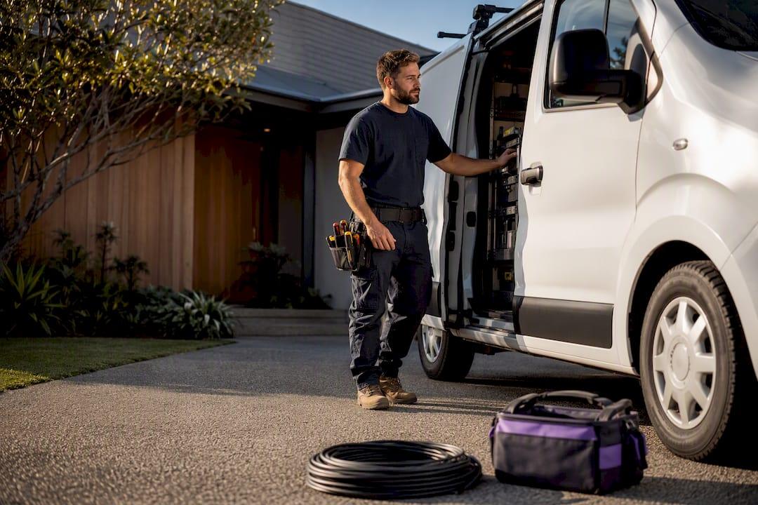
Pattern B, the small fleet: phone number paired with an online booking widget for less urgent jobs, a trust strip showing licence, insurance, and review score, a small gallery of three or four featured projects, and service cards arranged in a grid rather than tiles. This pattern suits a team of three to eight who can absorb a mix of urgent and scheduled work.
Pattern C, the specialist or high-ticket trade: lead with a striking outcome photo (a finished kitchen, a completed deck, a landscaped yard), pair it with a tender or quote-request CTA rather than click-to-call, and put your project gallery front and centre rather than buried on a separate page. High-ticket clients want to see your portfolio before they’ll pick up the phone.
- Never mix all three patterns on one homepage; pick the one matching your business size and stick to it
- Avoid stock photography in any pattern; it’s the fastest way to look like every other tradie site
- Limit yourself to one dominant CTA per pattern, with a secondary option visually subordinate
- Don’t stack more than two trust badges in the hero regardless of pattern
How Ask Hayley turns homepage enquiries into booked jobs
A homepage that converts is only half the job. Someone still has to answer the phone, qualify the lead, and follow up before the customer calls the next name on the list. That’s where voice-first lead intake pairs naturally with the layout above: when a call comes in outside business hours or while you’re up a ladder, Hayley answers and pre-qualifies the enquiry before it ever hits your inbox as a missed call.
Pair it with an AI Website Chatbot for visitors who’d rather type than talk, and you cover both channels without adding another screen to your day. A simple “what happens next” line under your quote form, something like “Hayley will confirm your details and book a time within the hour,” maps directly to that intake flow and sets the same expectation the form itself is making.
Three numbers worth tracking once this is live: weekly click-to-call events, quote form conversion rate, and average lead response time. If response time creeps past an hour during business hours, that’s your first sign the homepage is working harder than your intake process.
What makes a testimonial actually persuasive, beyond a Google star rating?
A star rating tells a visitor you’re liked. It doesn’t tell them why. The homepages that convert best pair a live review widget with two or three short, specific testimonials placed near the relevant service, not lumped into one generic “what our customers say” page nobody clicks through to.
A testimonial works harder when it names the job, not just the feeling. “Fixed our hot water system same day, explained the cost upfront, no mess left behind” beats “Great service, highly recommend” because it answers a specific fear a new customer already has. If you’ve got a case study worth telling, a full bathroom renovation with before-and-after photos, or a commercial job with a tight deadline you hit, give it its own short block with two or three photos and a two-sentence outcome summary.
Keep testimonials attached to the service they describe rather than centralising them on a single “reviews” page. A visitor reading about blocked drains wants to see proof about blocked drains, not a five-star review about a kitchen reno. Rotate two or three testimonials per service page so returning visitors or repeat searchers see fresh proof rather than the same quote every time.
Avoid the temptation to write your own composite quotes or tidy up a review beyond fixing an obvious typo. A slightly rough, specific, real quote reads as more credible than a polished one that sounds written by marketing.
What CTAs work besides click-to-call for tradie homepages?
Not every visitor is ready to pick up the phone, and treating click-to-call as the only path on your homepage leaves conversions on the table. A booking widget lets a customer lock in a scheduled job, like a gutter clean or an annual service, without needing a conversation first. That suits recurring or non-urgent work far better than forcing a call.
A chat option, whether it’s a live operator or an automated assistant, catches visitors who are browsing after hours or who simply prefer typing to talking. It’s a genuinely different audience to the one hitting your phone button, not a replacement for it.
Word your secondary CTAs to match the level of commitment they’re asking for. “Book a Free Quote” asks for less than “Call Now for Emergency Service,” so don’t give them equal visual weight. A booking button styled the same size and colour as your phone button confuses the hierarchy you’ve spent the whole homepage building.
Keep the total CTA count on the homepage to three at most: call, quote form or booking, and chat. Adding a newsletter signup, a social follow button, and a live chat popup all competing for attention turns your homepage into a wall of buttons nobody clicks confidently.
What layout principles matter most for a tradie’s homepage?
Visual hierarchy means the biggest, boldest, highest-contrast element on the page is the one you most want clicked, and for a tradie homepage that’s almost always the phone number. Everything else, headline, subhead, photos, trust badges, should sit visually beneath it in size and colour intensity.
Group related information together. A service tile, its icon, and its short description belong in one visual block, not scattered across the page with unrelated content between them. White space isn’t wasted space; it’s what stops a mobile screen from feeling like a cluttered noticeboard.
Colour contrast does real work here. A phone button in a colour that doesn’t appear anywhere else on the page draws the eye instantly. If your whole site uses the same blue for buttons, links, and headings, nothing actually stands out.
Keep the reading path predictable: headline, subhead, primary action, proof, then service detail, moving top to bottom on mobile without forcing a visitor to hunt sideways for information. A left-to-right, top-to-bottom flow matches how people naturally scan a phone screen, and fighting that pattern with a clever grid layout usually just confuses first-time visitors.
Should tradies use video on their homepage?
A short video of you talking through a recent job, or footage of the team on site, builds trust faster than static photos alone, because it puts a real voice and face to the business before a customer ever calls. It doesn’t need to be polished. A 30-second clip filmed on a phone, showing you explaining what a customer can expect, often reads as more genuine than a professionally produced ad.
Keep video below the fold, never as an auto-playing background behind your hero text. Auto-play video slows load time on mobile data and can bury your phone number behind moving footage a visitor didn’t ask for. If you use video, host it so it loads on tap rather than automatically, and keep a static, fast-loading image in the hero itself.
An interactive quote calculator, where a visitor selects their service and gets a rough price range before submitting a form, works well for trades with fairly standardised pricing, such as gutter cleaning or a standard hot water system swap. It’s less useful for a trade where every job varies wildly, like a full renovation, where a real conversation is unavoidable anyway.
Skip embedded 360-degree project tours and heavy interactive galleries unless you’ve genuinely got the traffic to justify the load time cost. For most tradie sites, a simple photo gallery with captions does the same trust-building job at a fraction of the performance hit.
How do you know if your homepage is actually generating leads?
Three numbers matter more than any others: click-to-call events, quote form submissions, and the time between a lead landing and someone actually calling them back. Google Analytics and Google Search Console, both free, will show you page views and search queries, but neither tracks a phone tap by default, so you’ll need call tracking set up through your analytics platform or phone provider to see it.
Set a goal or event trigger for every click on your phone button and every form submission, then check weekly, not monthly. A sudden drop in click-to-call events after a homepage redesign is the fastest sign something’s broken, whether that’s a button that moved, a slower load time, or a phone number that’s no longer displaying correctly on certain devices.
Response time deserves its own tracking line, separate from raw lead volume. A homepage generating twenty enquiries a week means nothing if the average reply takes six hours, because most of those customers have already called someone else by then. Compare your weekly call volume and average response time month to month, and treat any homepage change, a new headline, a repositioned CTA, as a test with a before-and-after number attached, not a guess.
Get your homepage built without the back-and-forth
A tradie shouldn’t need three months and a marketing agency to get a homepage that does the job described above. Ask Hayley’s One Page Website is built specifically around the pattern this guide lays out: click-to-call hero, proof anchor, short quote form, and a clear service area statement, without the drawn-out design process a full agency build usually demands.
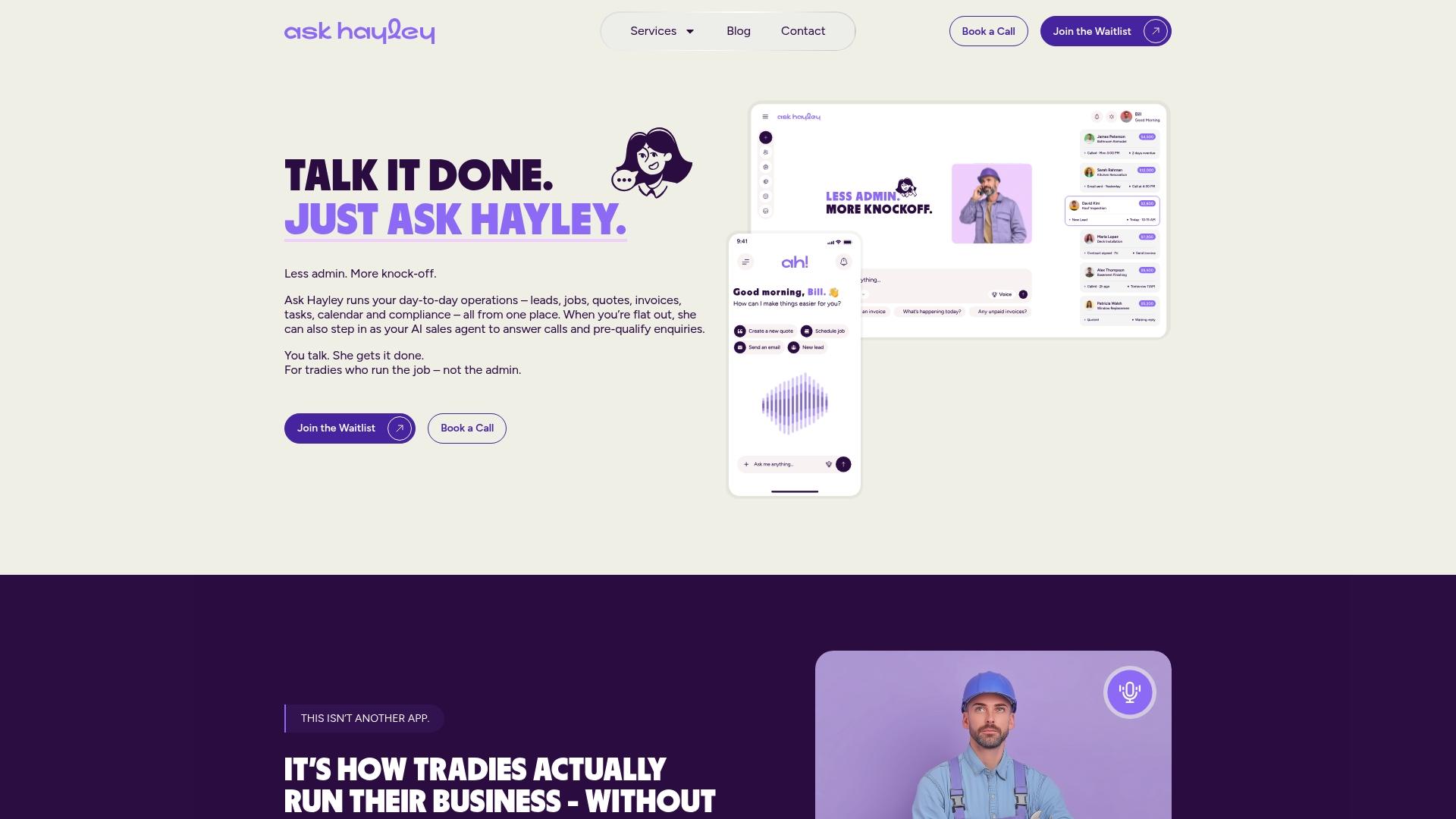
Pair the homepage with the AI Website Chatbot and Hayley’s voice-first call handling, and every enquiry that comes through the site, by phone, form, or chat, gets picked up and pre-qualified before it ever reaches your inbox as an unanswered notification. If you’re weighing up whether the investment is worth it against the cost of a homepage that isn’t working, it’s worth reading through what a missing or underperforming website actually costs a trades business in missed calls alone. Ask Hayley also handles tendering and safety and compliance documentation for tradies who need more than just a homepage sorted.
Book a quick consult through Askhayley and see what a homepage built around your actual phone volume and job types looks like.
Hayley’s perspective: don’t overbuild the homepage as you grow
Once the calls start coming in steadily, resist the urge to add more sections, more CTAs, more sliders. Clarity beats decoration every time, even at scale. Watch two numbers as you grow: weekly phone calls and average lead response time. Revisit your top three service and suburb priorities once a year, because what ranked and converted last year isn’t guaranteed to hold this year.
— Hayley
Sources
These sources informed the performance targets, above-the-fold principles, and mobile usability specs referenced throughout this guide, from ServiceScale’s tradie web design benchmarks to PWD’s mobile usability standards.
- Responsive web design for tradies
- What is above the fold
- Tradie website design examples that win more jobs
- Above-the-fold design
FAQ
What are the 7 Cs of a website?
The 7 Cs, commonly cited as clarity, content, consistency, credibility, convenience, connectivity, and calls to action, are principles for judging any website’s effectiveness, not a fixed checklist. For a tradie homepage, clarity and calls to action matter most: a visitor should know your trade, your area, and how to reach you within seconds.
What are some good websites for tradies?
A good tradie website leads with a tappable phone number, names the trade and service area in the headline, and shows real project photos rather than stock imagery. Ask Hayley’s One Page Website is built around exactly this pattern for tradies who want a fast, working homepage without a lengthy agency process.
What is the best website builder in Australia?
There’s no single best builder for every tradie; the right choice depends on whether you want a fully custom build, a template-based DIY site, or a managed one-page solution built specifically around lead generation. Ask Hayley’s One Page Website is designed specifically for trades wanting a phone-first, mobile-optimised homepage without managing the build themselves.
How do I set up a website in Australia?
Start by registering a domain name and choosing hosting, then build a homepage following a mobile-first layout: hero with click-to-call, a short quote form, and proof anchors like licence details and reviews. From there, add dedicated pages for each core service and your top three suburbs, keeping PageSpeed mobile scores above 70 as a baseline before launch.
How many suburb pages should a tradie homepage link to?
Start with your top three suburbs rather than trying to cover your entire service area at once, since thin, templated pages for every postcode dilute ranking power. Expand to more suburbs once those first three pages are ranking and converting reliably.


